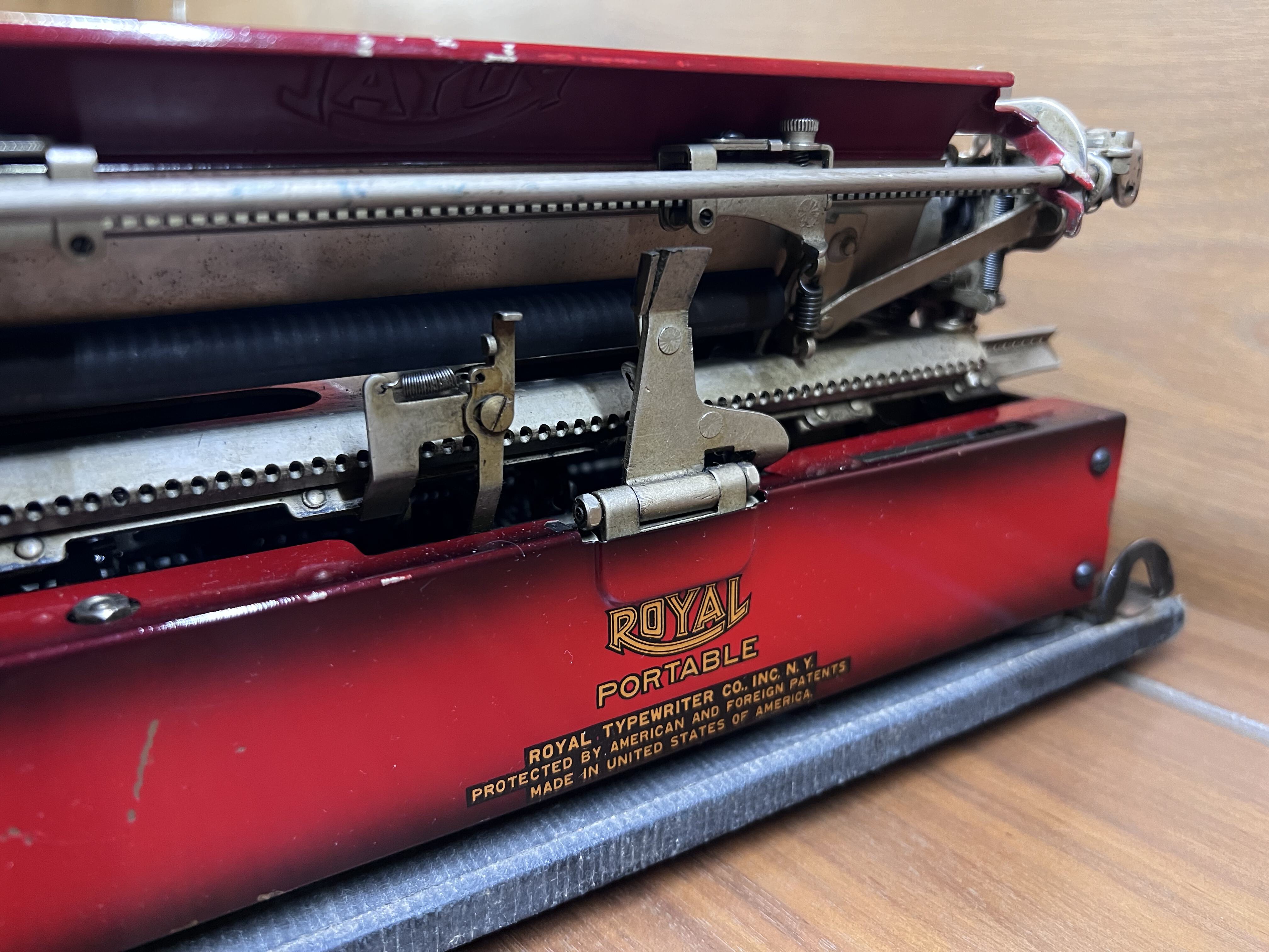
Red Royal in Vogue
Billed as a font for personal correspondence, this stylish font is the cherry on this beautiful Royal Portable.


Popular, Fashionable, Vogue
Red is always an eye-catching color. In Vogue and with the wagon wheel spools, this particular machine is one of the more unique and attractive combinations out there, has gotten some TLC so far but is always bringing some character to the writing desk.

Built in 1929 this machine is one of the early body styles before the gull-wing ribbon covers. The greater coverage of the later style ribbon cover does protect the ribbon, but when it has these spoked spools it seems a shame to cover them up, That said This ribbon is probably at greater risk of drying out as a result.
On the subject of color and durability, I was taken aback by just how delicate the duo-tone paint is on these machines. It is generally good practice to test any solvents used for cleaning in an inconspicuous spot first, however this machine has no tolerance for even the mildest of solvents. DO NOT USE ALCOHOL, even though Isopropyl Alcohol is often considered safe on most finishes, it will simply wipe away this gorgeous color.


When it comes to functionality, this one is reasonably feature-rich for the time, By comparison to later models though it is most certainly lacking. The lack of half-line spacing a real drag. On the other hand, the margins being hidden by a paper tray feels very intuitive, especially if you have used the later Magic Margin systems from Royal. That said, the lack of a proper support does leave the slack paper flopping around.

There is good visibility into the segment though, especially through the Jitter which makes it possible to see exactly where you are on the page, Many other machines have too small of a space, requiring you to look up to the paper bail instead.

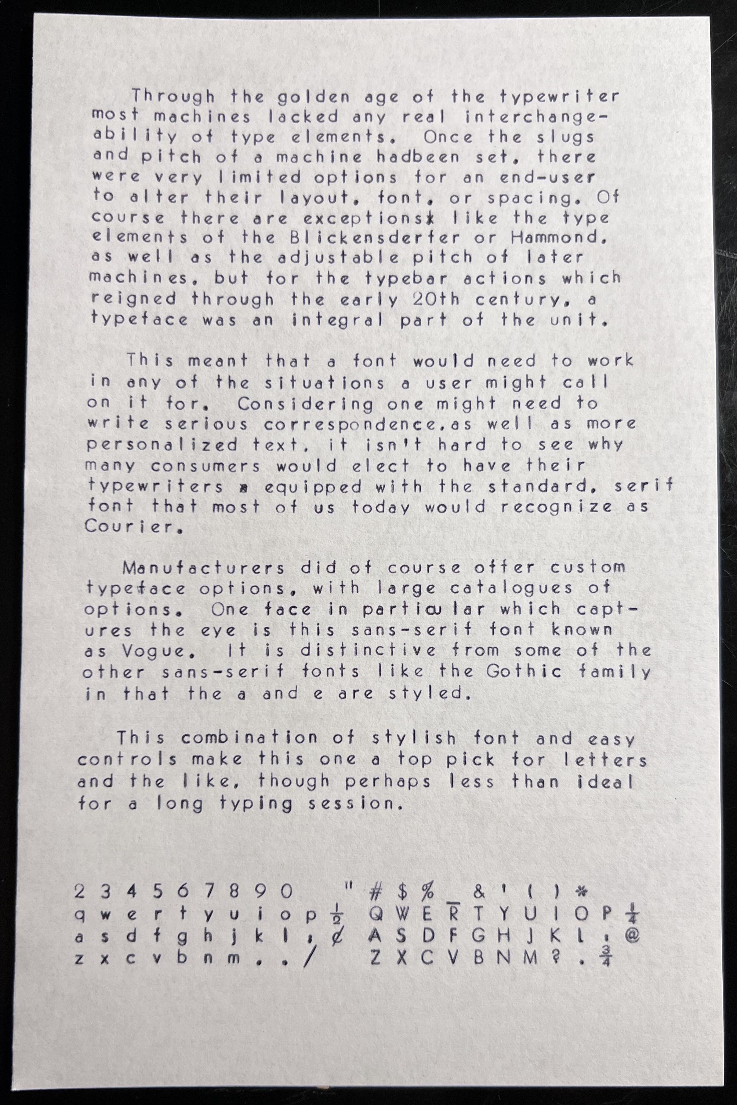
Through the golden age of the typewriter most machines lacked any real interchange- ability of type elements, Once the slugs and pitch of a machine had been set, there were very limited options for an end-user to alter their layout, font, or spacing. course there are exceptions like the type elements of the Blickensderter or Hammond, as well as the adjustable pitch of later machines, but tor the typebar actions which reigned through the early 2Oth century, a typeface was an integral part of the unit.
This meant that a font would need to work in any of the situations a user might call on it for. Considering one might need to write serious correspondence,as well as more Personalized text, isn’t hard to see why many consumers would elect to have their typewriters equipped with the standard serif font that most of us today would recognize as Courier.
Manufacturers did of course offer custom typeface options, with large catalogs of options. One face in particular which captures the eye is this sans-serif font known as Vogue, it is distinctive from some of the other sans-serif fonts like the Gothic family which also often appear on typewriters.
This combination of stylish font and easy controls make this one a top pick for letters and the like, though perhaps less than ideal for a long typing session.