Generating Thoughts
Lately the world of generated content has advanced startlingly fast. This post skims some of those advances and grounds them in a marvelous Gossen Tippa.
I think that it's fair to begin this by setting the baseline that overall I am a skeptic of most things. That sentiment is particularly true when it comes to technology, there is nothing more tempting than the allure unknown rewards of what was not possible in the past. Lately it's been difficult to escape the snake oil and the stoic skeptics when it comes to synthetic content.
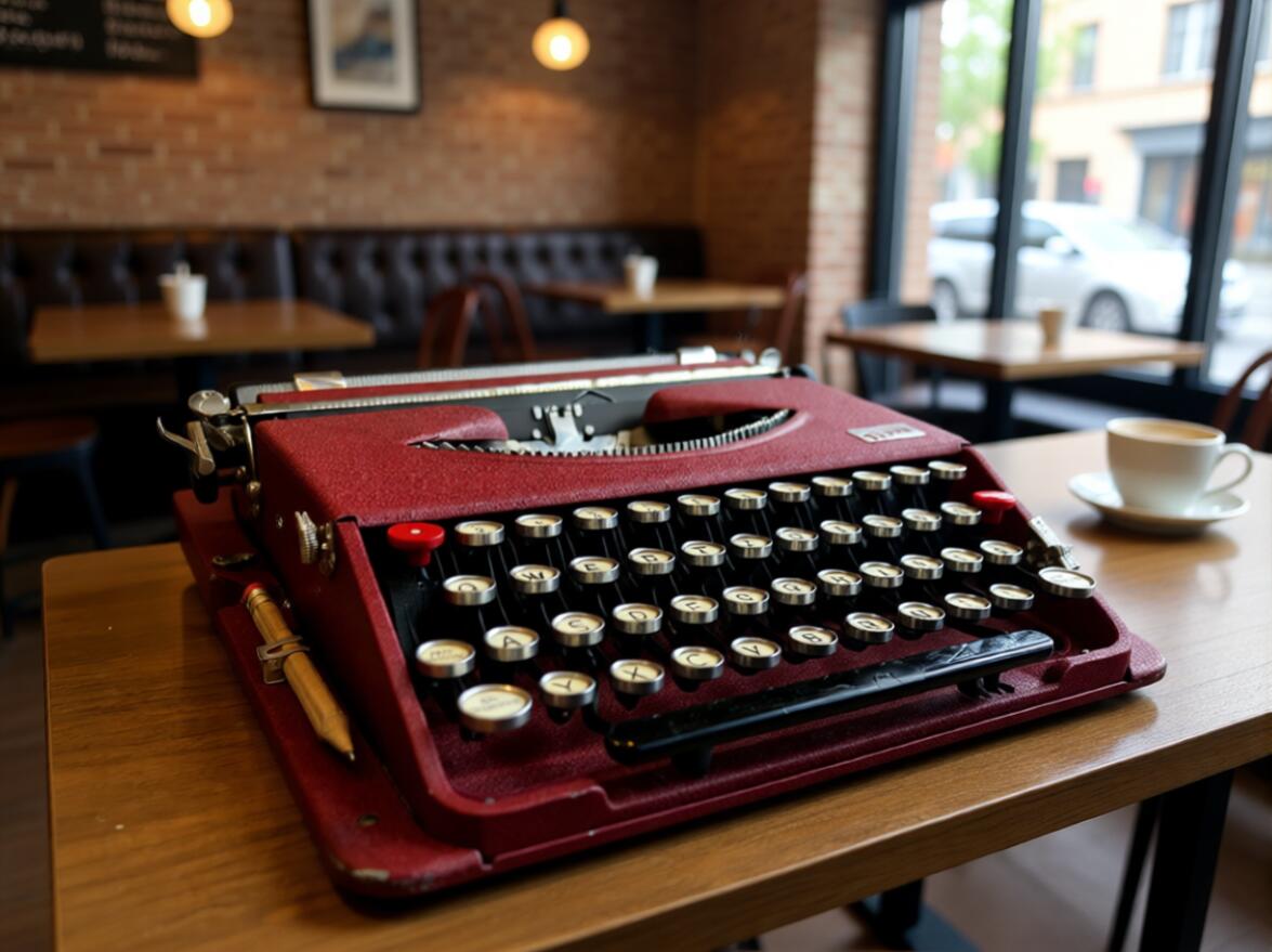
Even if we choose to ignore it, trusting in our innate ability to pick out fakes and the non-human is asking to fall victim to our own overconfidence. Lately I have been messing around with some generative models. At first I expected rather little and I figured that I would have some laughs before binning the projects.
Once the inferences finished and I laughed my way through some obvious foibles of diffusion, I found myself rather nervously looking at convincing images created with consumer hardware and limited overhead; each of the examples here are indeed cherry-picked, but they are the best of between 5 or 10 examples, usually executed within about 15-20 seconds per image and at the power cost of running a standard TV.

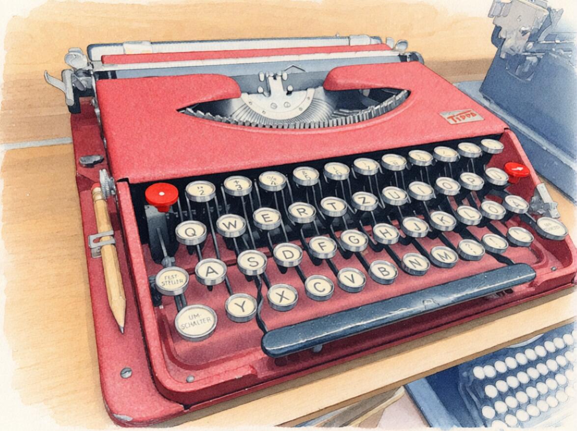
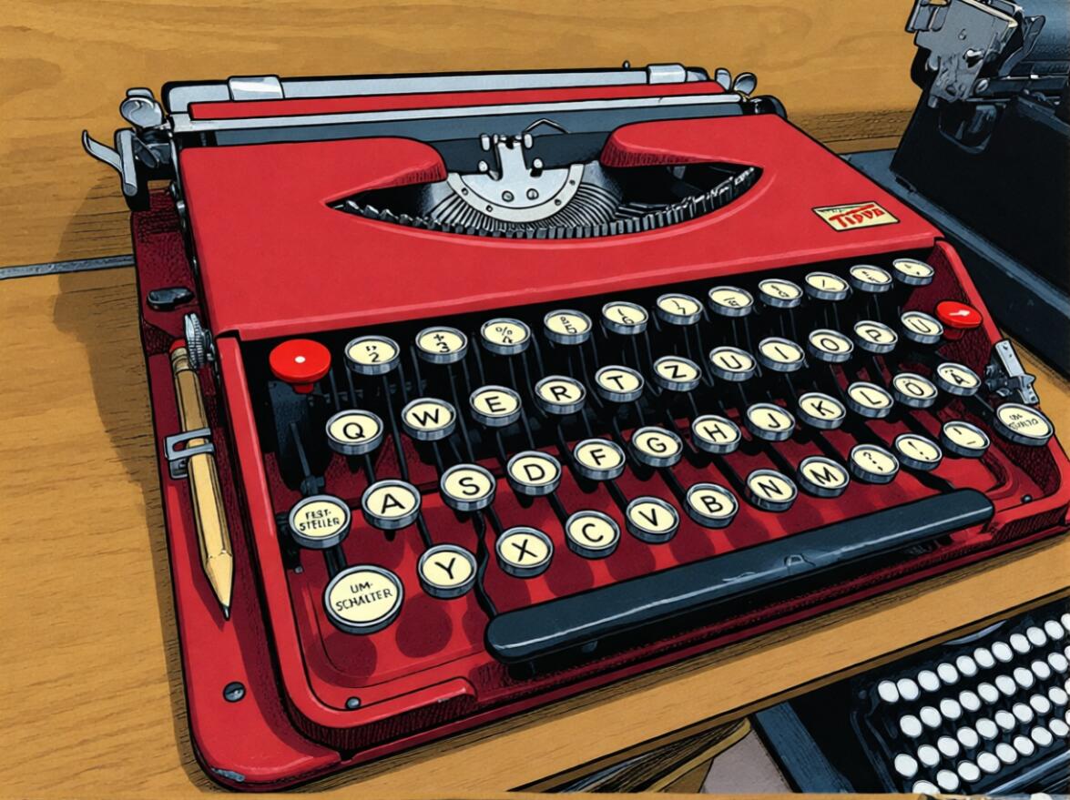
Most of the images in this post are from an image-to-image workflow series, and they are based on this primary image. It seems relevant to level-set with this image, as this is nothing more than a phone-camera shot and the rest of the magic is in the diffusion models that break it up and recombobulate it. That said, I 100% promise that the image above is indeed an authentic, crummy photo of my own doing.
Stylish Substitutions
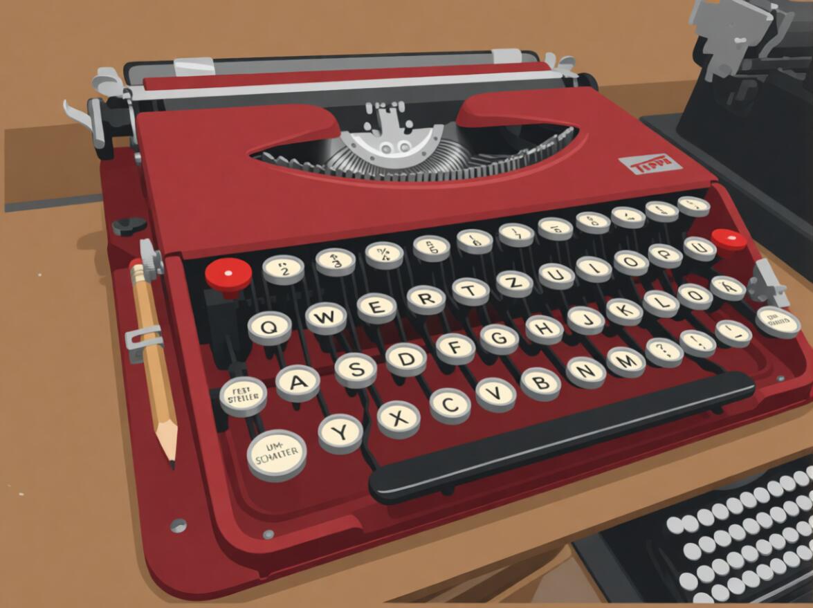
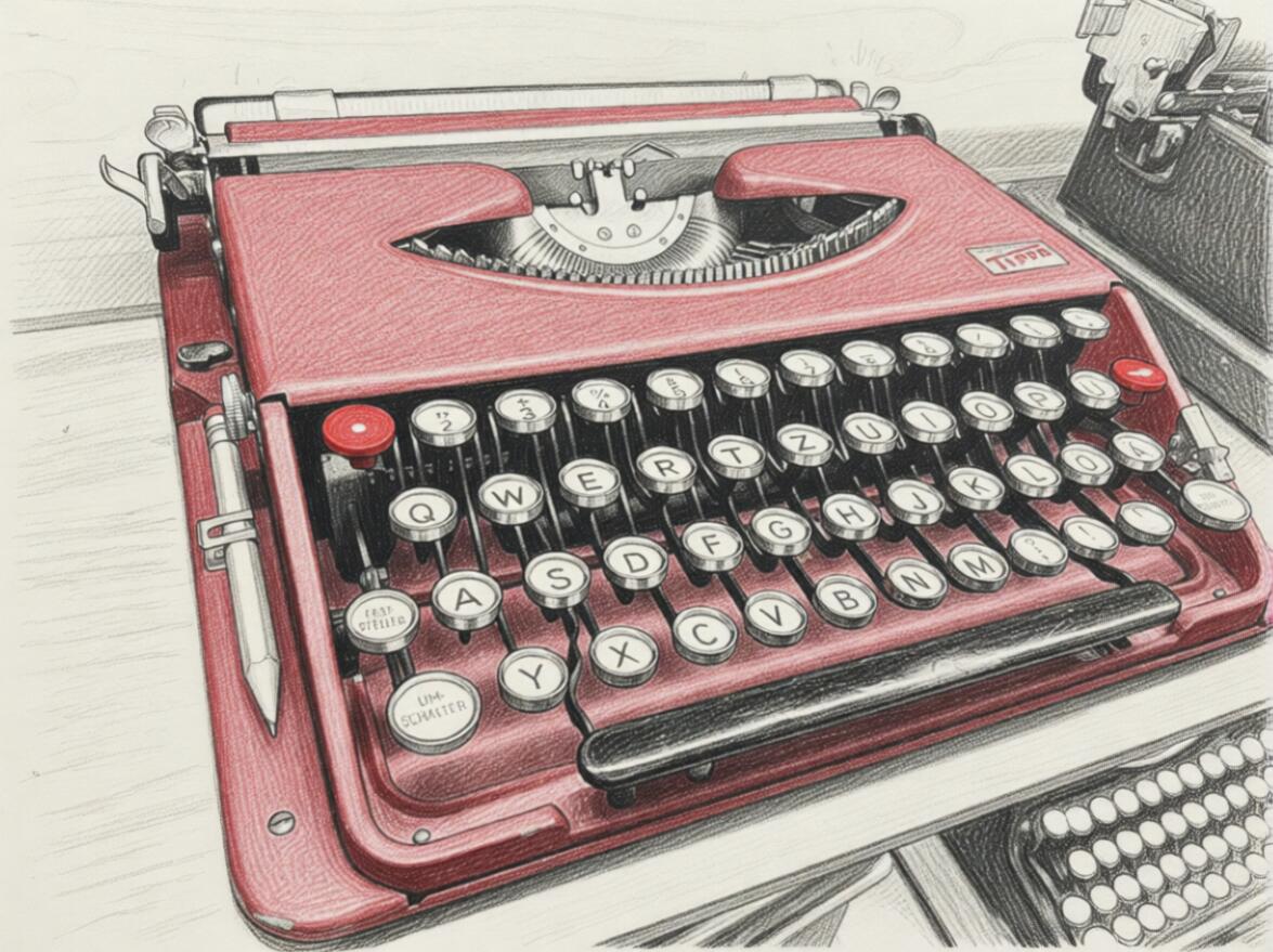
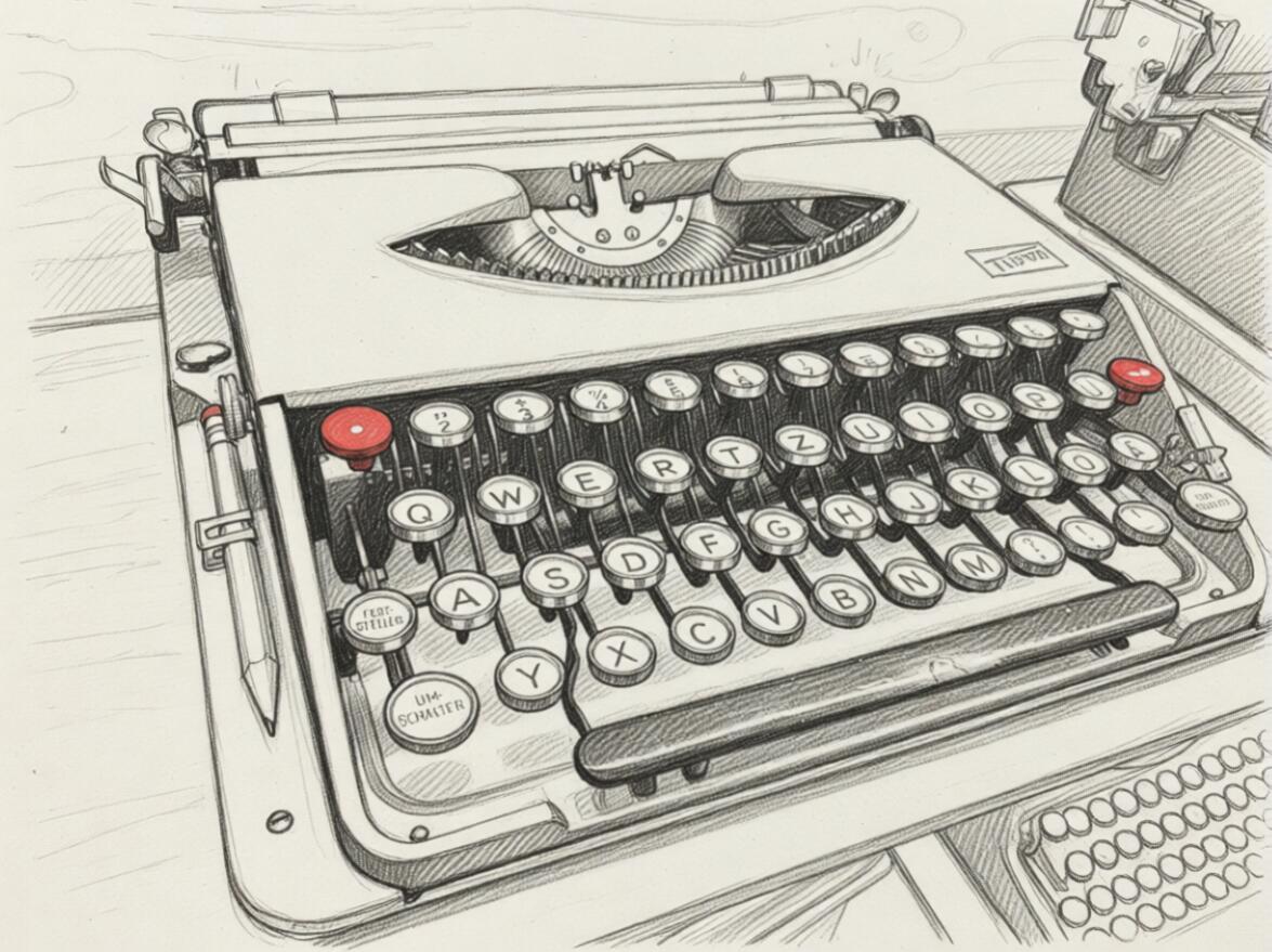
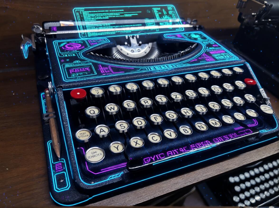
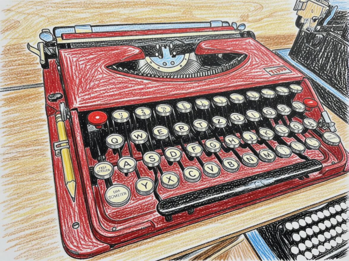
Back about 10 years ago I recall a cutting edge presentation on the future of style transformations - inputting an image and getting back a machine-translated version of that image but in an entirely different style. At the time it seemed futuristic and a bit silly, however that capability is well and truly here. Here are some examples of the assorted "re-styling" images from the original photo. While each of these images is most certainly a failure in their own discipline, they represent something that I as an individual would struggle to master if I aimed to replicate in the physical world and subsequently digitize. Again, each of these images simply required naming the desired style with a simple prompt such as "draw this image as a pencil sketch" or substituting the style for "painterly style". Even swapping out for an aesthetic switch and requesting to make it a "cyberpunk computer terminal" gives us a fun laugh.
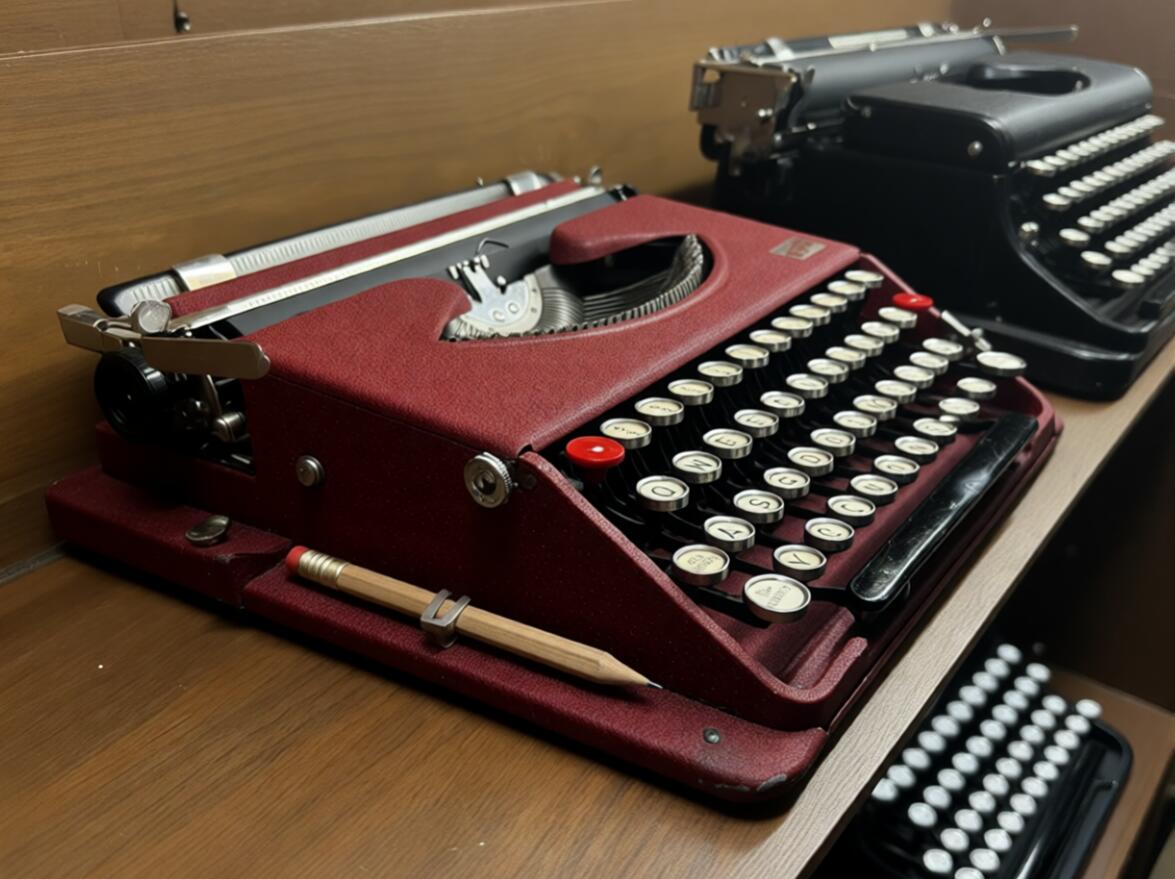
I share some of these style-changes images with a good friend, someone familiar enough with typewriters, enough to recognize an H3k in the wild but who has no collection of their own. When I presented these images and left the door open to describe what felt wrong, I received a confident response that they were indeed fictionally generated; the image in the bottom shelf appeared to have too many rows of legends. I regretfully informed them that it was indeed a 4-bank typewriter in real life. Those of us more seasoned in this world might have a more nuanced intuition here though; the machine on the shelf below is in fact a traditional 4-bank typewriter. Remember that thought for later though.
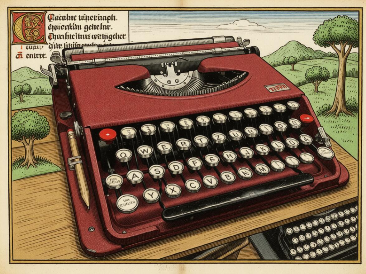
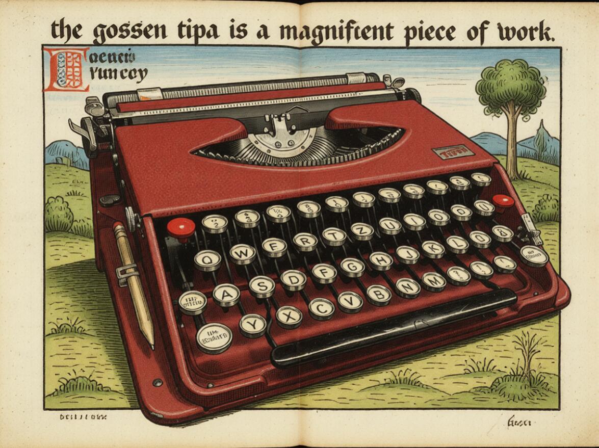
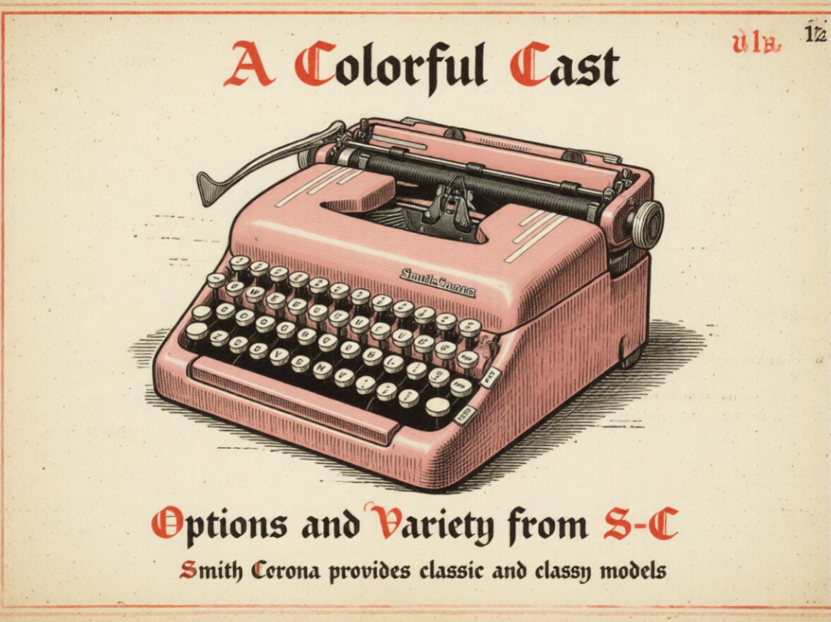
While these style transformations make for funny gags, a fair critique levied against these models and their output is the lack of consistency in the output. that there's a need to have these machines appear as if they are part of a manuscript of a vintage advertisement. While it's unlikely that anyone has a particularly strong need for this specific style, this might be your particular art style, an aesthetic, or event just a particular image composition.
I Want THAT one and I want it Now
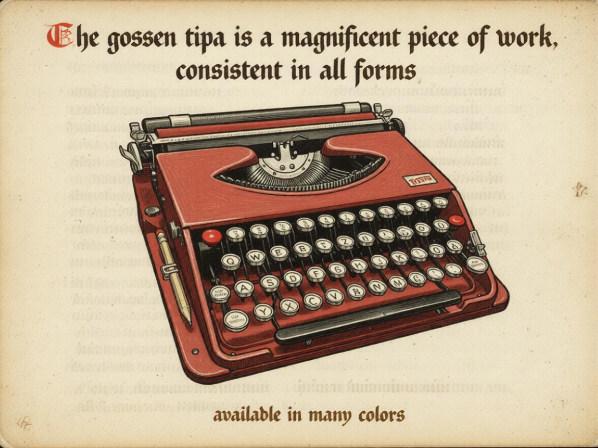
In the same way that critics of Taylor Swift are able to pick out identifying musical signatures, a particular qualitative signature can be embedded into an image through low-rank adaptation; effectively just a compressed matrix that gives simplified heuristics for replicating a style. I'm glossing over LoRa architecture, but these images also highlight one of the very impressive parts of the current models - their ability to handle verbatim instructions and text inputs. In the examples above the prompts request a rather explicit text string to be displayed in a given region.
The models parse these out and manage to even get the proper "manuscript" style, a blackletter aesthetic from the original fine-tune overriding the "advertising" prompt here. For those willing to classify their own image and text pairs, an artist could train your own models to replicate your own style at scale.
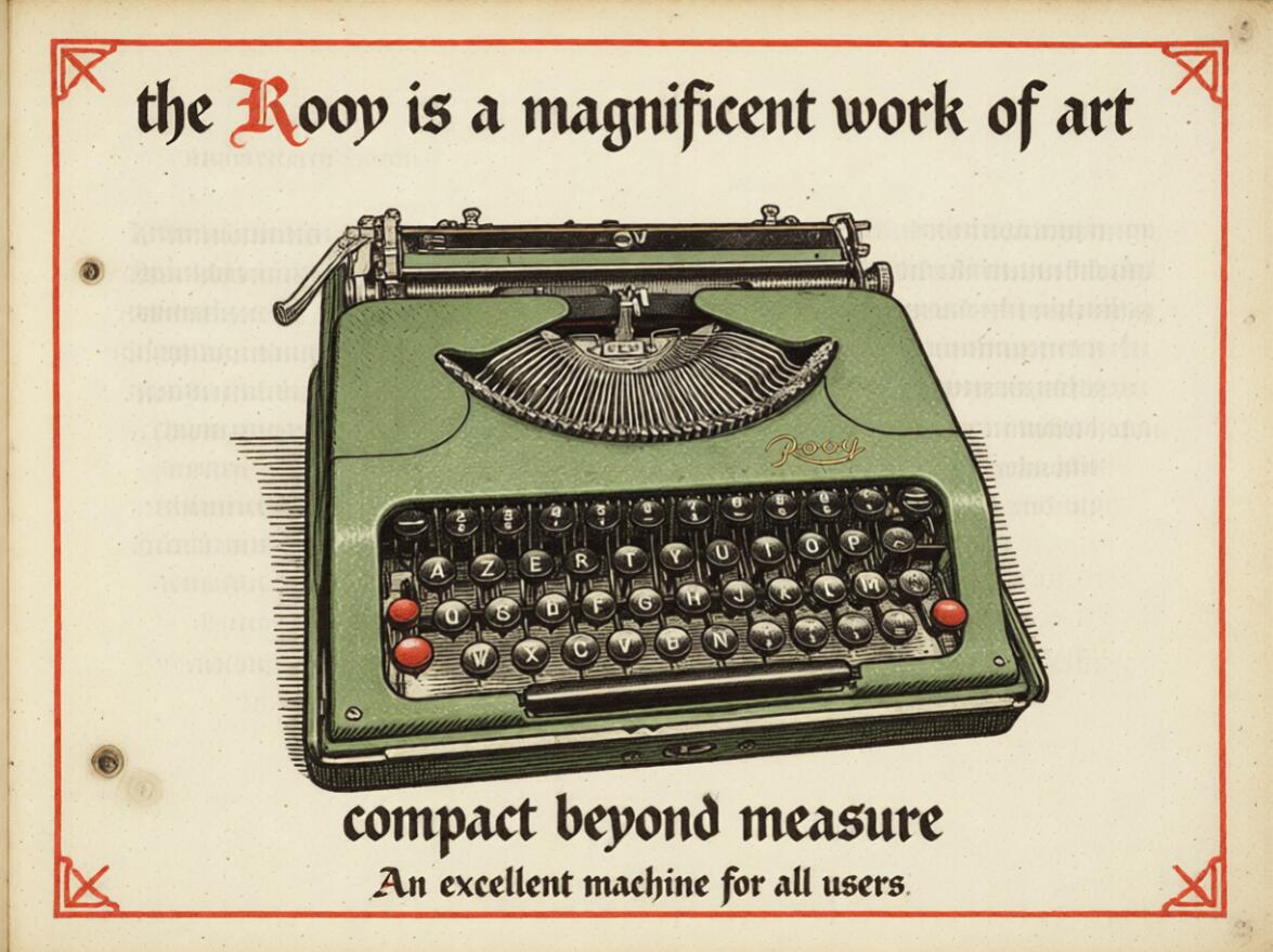
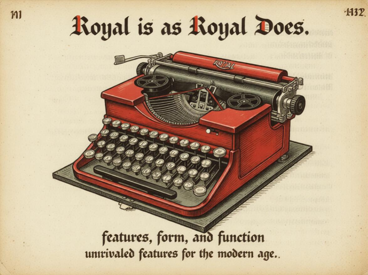
Here the same set of inputs were switched over to a different starter image - all machines which have been posted here previously, but with some updated text instructions.
The instructed text was replaced with slogans I thought sounded at least adjacent to their respective make, however since all of the prompts kept the same instructions and style adaptor, they all feel as if they could have been made by the same vintage marketer if you weren't looking too closely. An interesting twist - you might see the improper spelling of Tippa and attribute that to poor capability of the generation. Unfortunately, this turned out to be an error all my own; as I was swapping out slogans I missed a key. While it would be trivial to go back and correct it, I think it highlights an important point that we are plenty capable of introducing our own error to the system.
Can You See the Matrix?
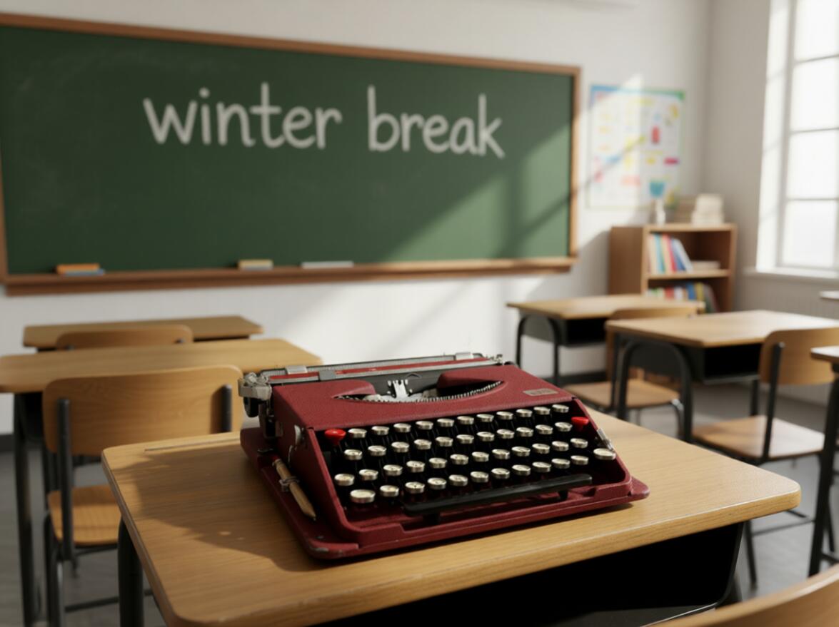
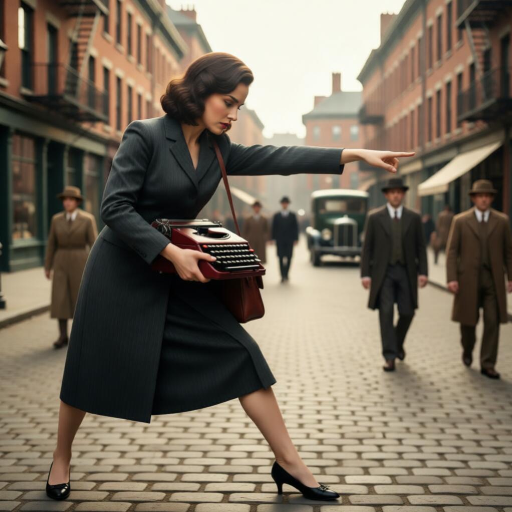
Beyond simple style consistency there are serious issues with prompt understanding. Most of the models you are able to run on offline setups struggle with some of the basics when it comes to positioning and situation. Some of the recent models really break out of this however and manage to understand even very simple instructions. For example these two are simply "a woman is holding the typewriter in an old-timey city" and "place the typewriter on a desk with the text 'winter break' on the chalkboard".
Again, the text manages to come out quite intelligible even if it's a bit overly precise for handwriting.
These are obviously not photorealistic and don't require much inspection to identify as generated content, but both could be easily passed through filters to sharpen the lines and add details. The important part is that very simple, human-readable instructions dictated the composition of the image and they are largely believable. The proportions are a bit wonky, storefronts are missing names, the text is a bit too clean, but if you were skimming or already primed to expect that content, you might not notice.
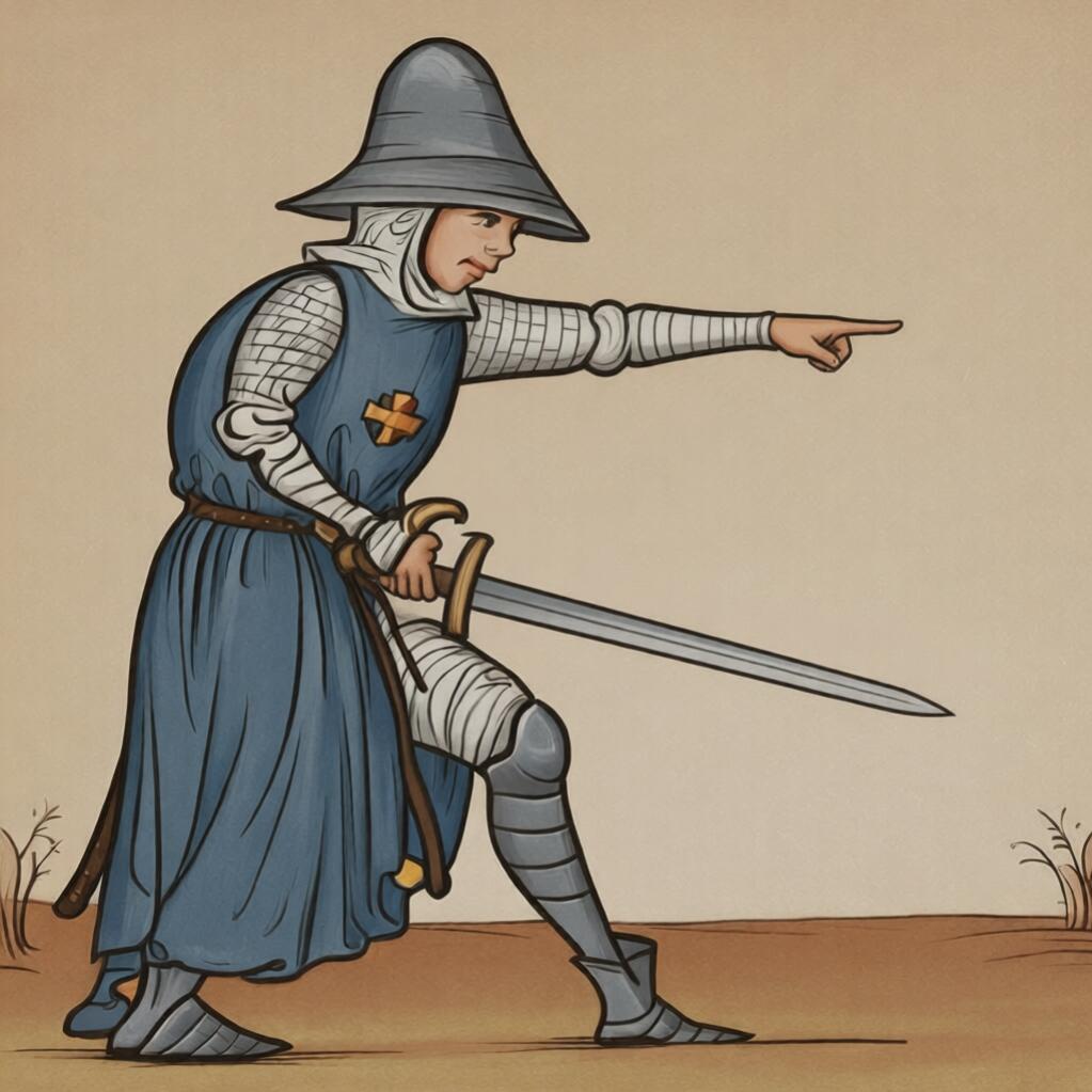
While leaving the interpretation of "hold the typewriter" might be enough for some cases, let's say there's a specific scene that we need to structure. Using a model that extracts the pose, we start with a random image that has a human holding an object and is gesturing - we're able to extract the wireframe of that image and pass only the rough idea of the pose we want. Combining that with our original image of the woman holding the typewriter, we're able to keep the same style, but specify exactly the composition of the image and leave the rest to the computer. As we can see here it is eerily effective.
In the past, hands and fingers were an obvious tell for generated content and it requires specialized tools and workflows to get quality images, these images were the first ones I generated and did not require any fine-tuning with inpainting or detailers. It's important to note that these tools still exist, but they now are used for more specialized purposes, covering up those less-obvious signs of synthetic content.
I Welcome our Robot Overlords
If you've read this far, you might have gotten the sense that I'm a general advocate for these tools. I am still very skeptical of their true value and worry greatly about the brain drain that results from outsourcing the most important thing we do: thinking. I share so that folks who might skip these tools entirely might get a more measured take on their capabilities.
Perhaps most important however is the fact that as these tools become increasingly capable, it's difficult for us to avoid the expectation to use them. Particularly as these tools become more and more centralized in proprietary models and behind paywalls, the value of open-source alternatives becomes critical. All of the models, tools, and adapters were available for free, however not all have commercial licenses.
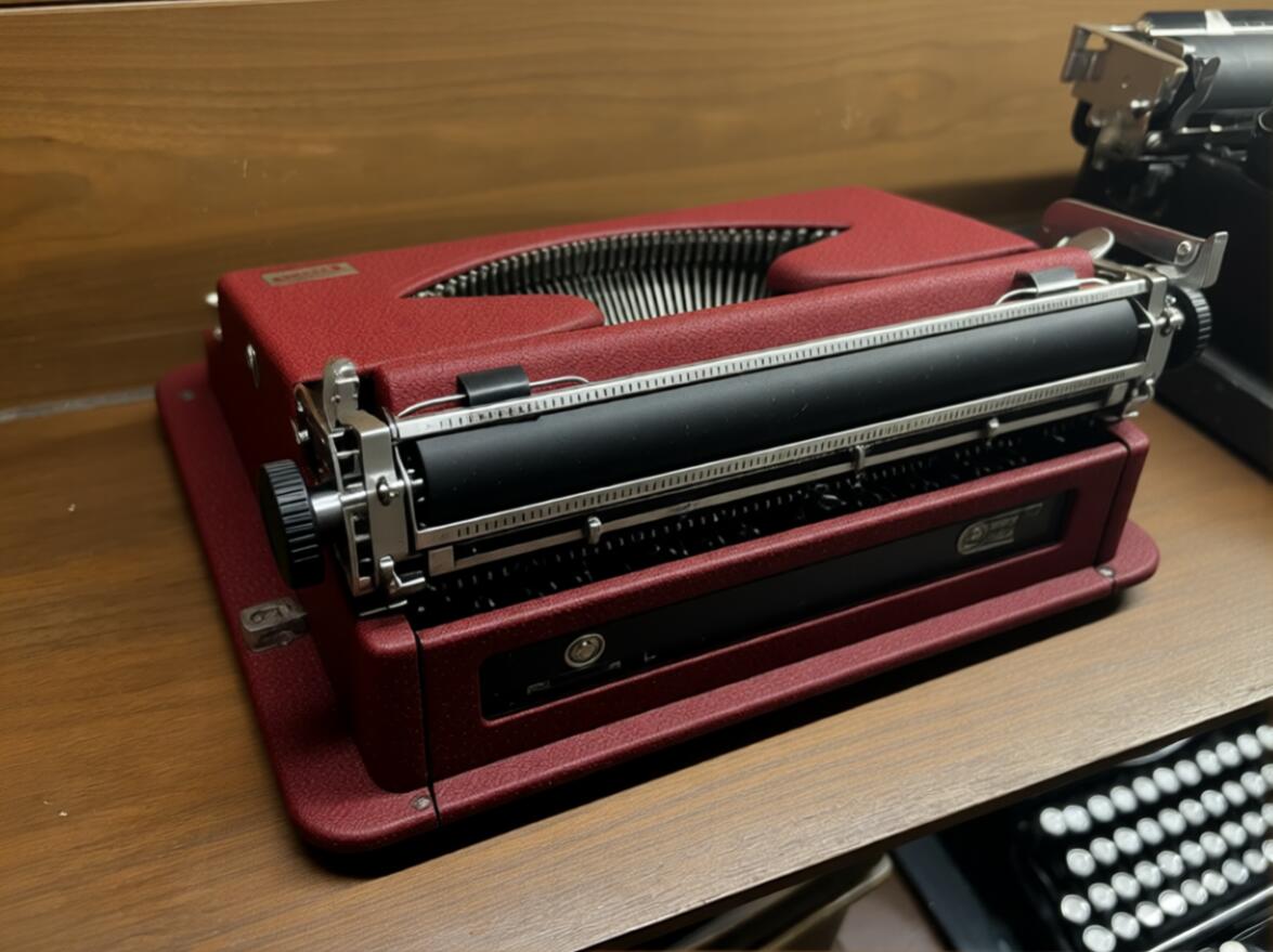
Okay, so, how about some levity. One of the particularly clever LoRa models out there is one that associates text with changes in a camera angle - this means that we can use a simple text prompt to rotate an object and we'll get back the most statistically likely view of what that object looks like. Here we instructed the diffusion process to rotate 90° and another to view it from behind. This allows us to digitally rotate an object even though the model doesn't actually have information about the particular image. Let's see how it did:
The view from the back is comically bad, what with an impossibly contorted platen, some strange non-rounded feed rollers and more. The slightly rotated example is a little less egregious however. The flag on the carriage return arm is missing and the retaining latch has turned into an entire ledge that does not exist on the real machine.
Many of us would intuit that something was wrong with even this photo. Nevermind whatever that monstrosity in the background is; a QDL x Progress with a right side return arm, and 5 rows of keys?? There's plenty to laugh about here, but do notice that it was able to correctly position the Tippa badge when it rotated the machine. While we laugh about how far it has to go, it does seem to make steady progress.
Implications
Okay. So there's some funny images and some might look more or less realistic. So what?
For most of those who would bother reading here it's fairly obvious when a machine has been touched up. We know where to look for the wear spots and we've got an eye for reading the life that a typewriter has had. But what happens when you can lightly touch up a machine digitally or dust it off without taking it out of the case again?
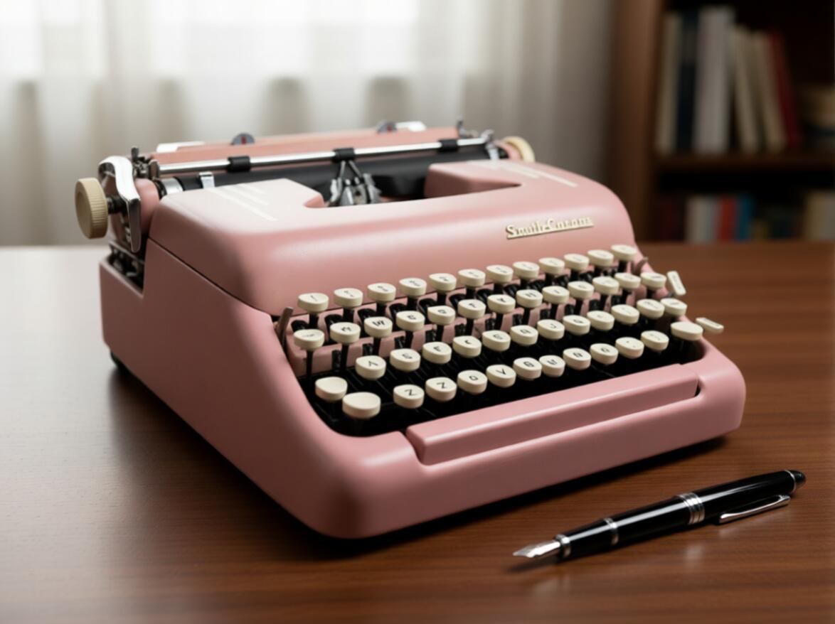
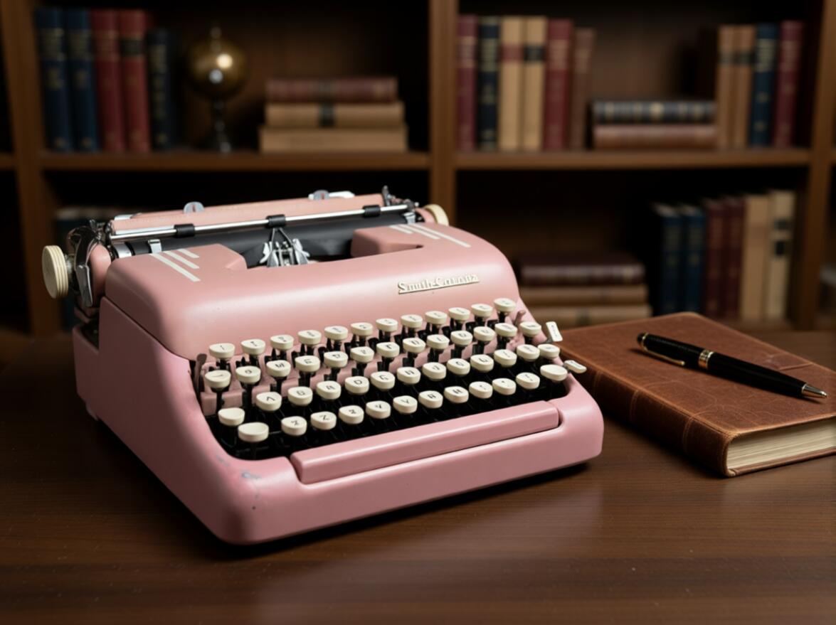
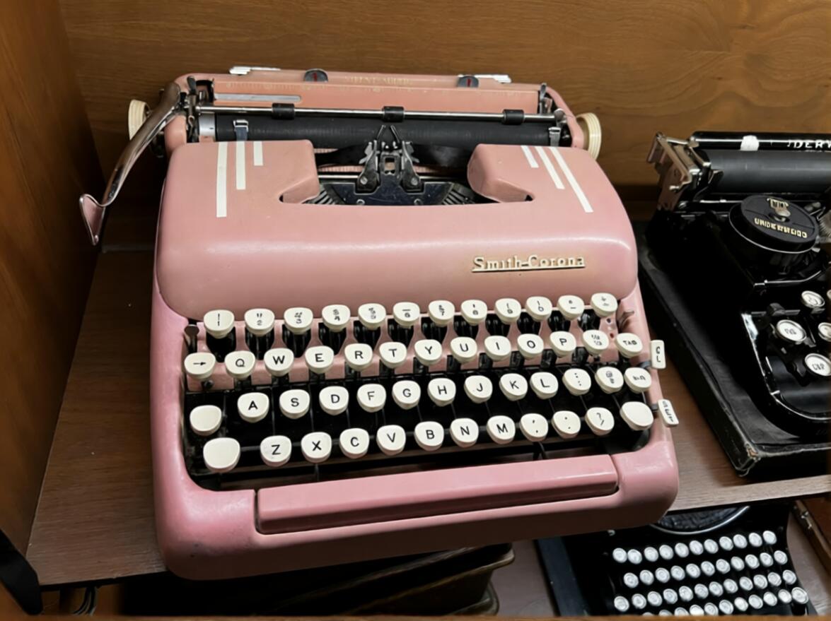
Here's an image of a pink Silent-Super before I attempted to touch up the body paint. My actual touchup was mediocre at best, however a quick instruction to "touch up the paint" left it looking as if it had been freshly plucked from the assembly line.
Clearly, any of us could pick out the fake a mile away, right? But how about this more subtle one where the rest of the image remained the same? A close enough inspection might make it obvious, but certainly enough to survive a cursory look and might make us more willing to travel to meet someone or take a risk on shipping.
Obviously, this isn't really a post about typewriters. While the subject of the images is a magnificent piece of work, consistent in all forms, and available in many colors, the true subject here is hubris. All of these images were made on a home PC using freely available models, the proprietary ones are easily a generation ahead and skilled users are able to compose, modify, or style an image (or video) in nearly any way imaginable.
Despite this, I consistently find that people are confident that they'll be able discern what is real. I hope this gives folks some good examples of what is or isn't synthetic and perhaps encourages a little more skepticism in the world.
Don't worry though - this post was most certainly, absolutely, and positively written on a typewrater.
Edit - This post was written before the release of Gemini 3 and the November releases of Z Image, which each seem to be upping the ante. As I've now heard quite a few times: "This is the worst these models will ever be" seems eerily true.
